PROJECT
Go back home
B2B SaaS
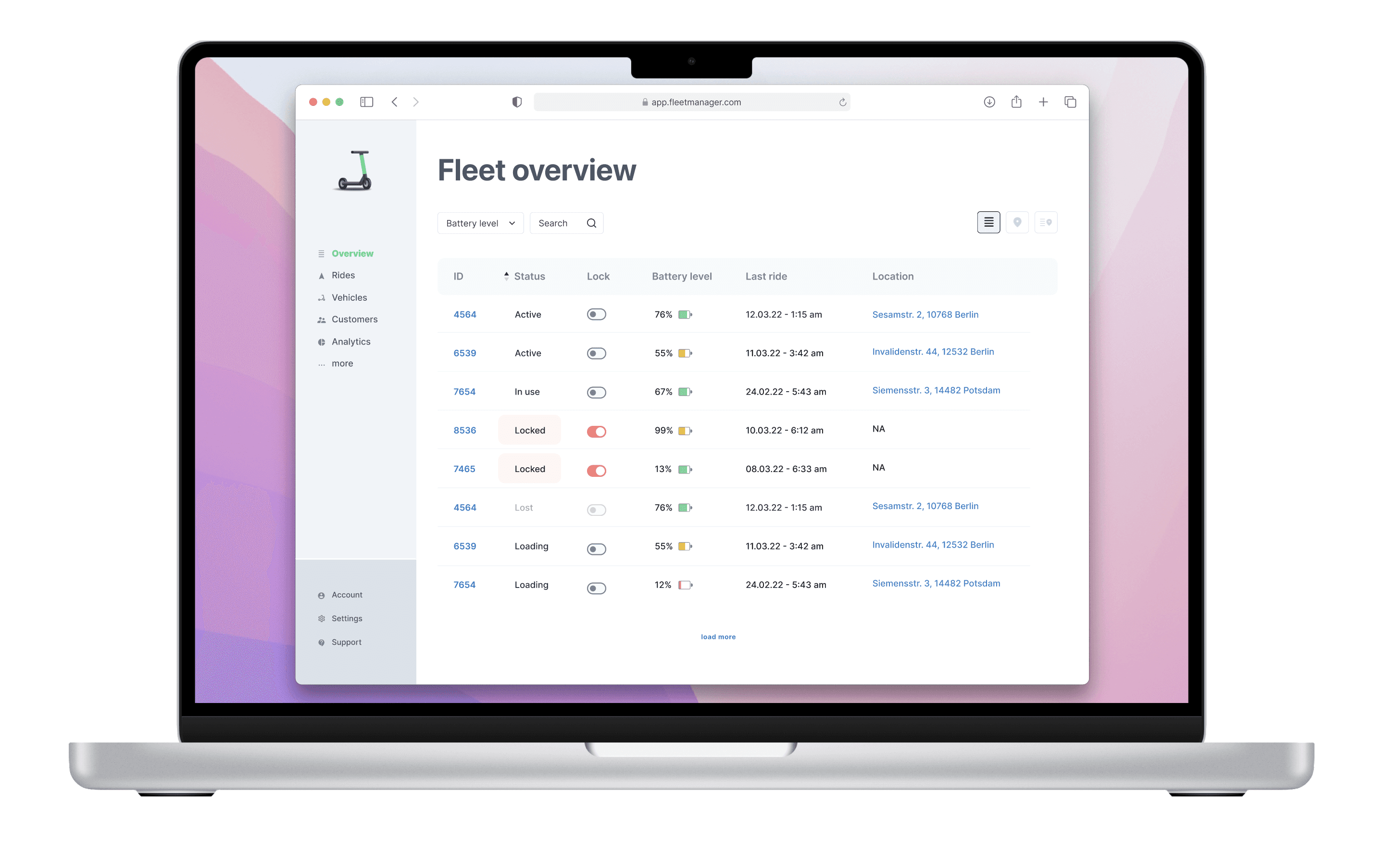
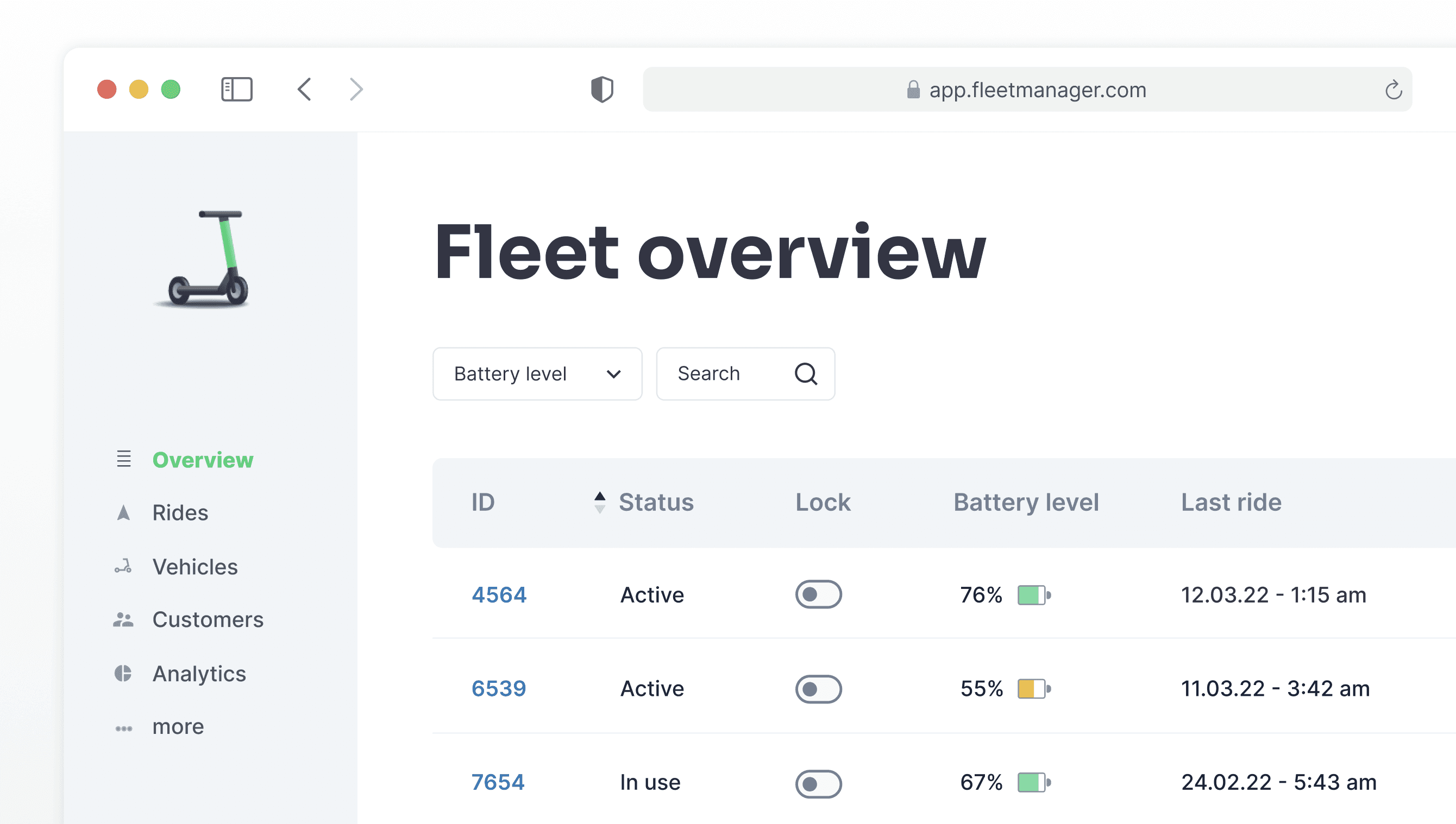
A visual feature exploration for a white label fleet management app. The customer is a sharing service operator. With the prototype we quickly explored the potential data indication for position, lock status, ID, battery status and the like. Goal was to better communicate ideas with a tangible prototype and have a first user test ready interface.
Dealing with only some vague requirements and hypothesis and the fact, that there are already quite similar interfaces out in the wild I went with a fast and very pragmatic approach. Desk research, simple design exploration, with a segmentation of view and interaction layers to determine where the blind spots are.
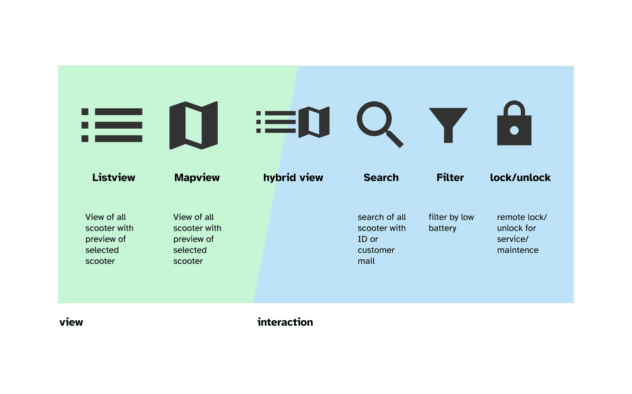
A divided design exploration for viewing and interacting
Our main goal was to quickly find out the blind spots we had with our design. I anticipated that we will have many unanswered questions, so I categorized them in order to have a clear prioritization. While an interaction always can be quickly prototyped without much design efforts, an entire view depends on more design efforts in order to make it work for the users.
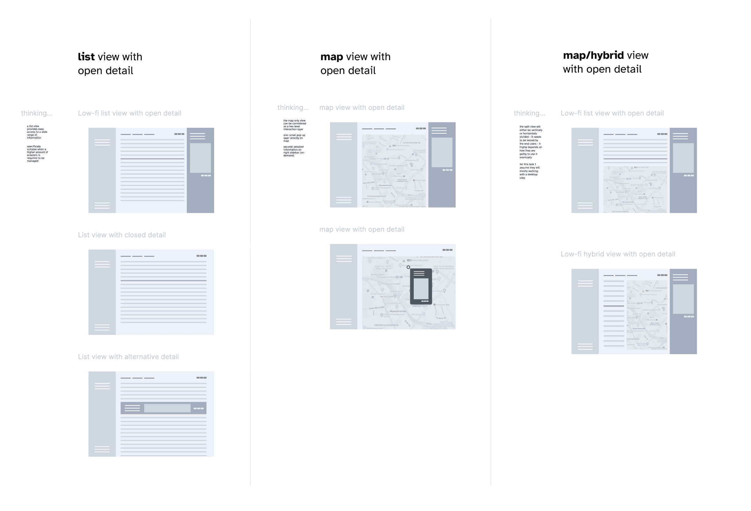
Exploring use case sensitive views
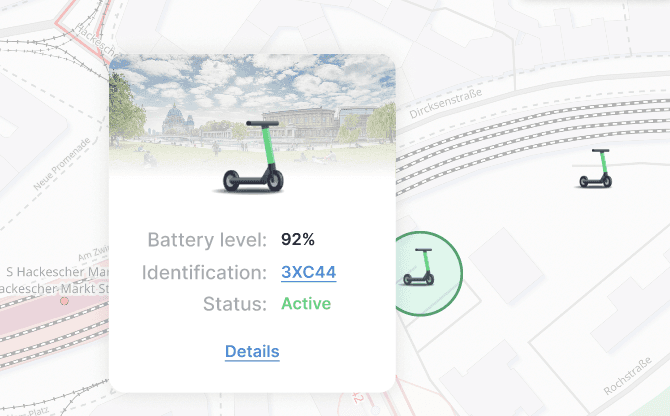
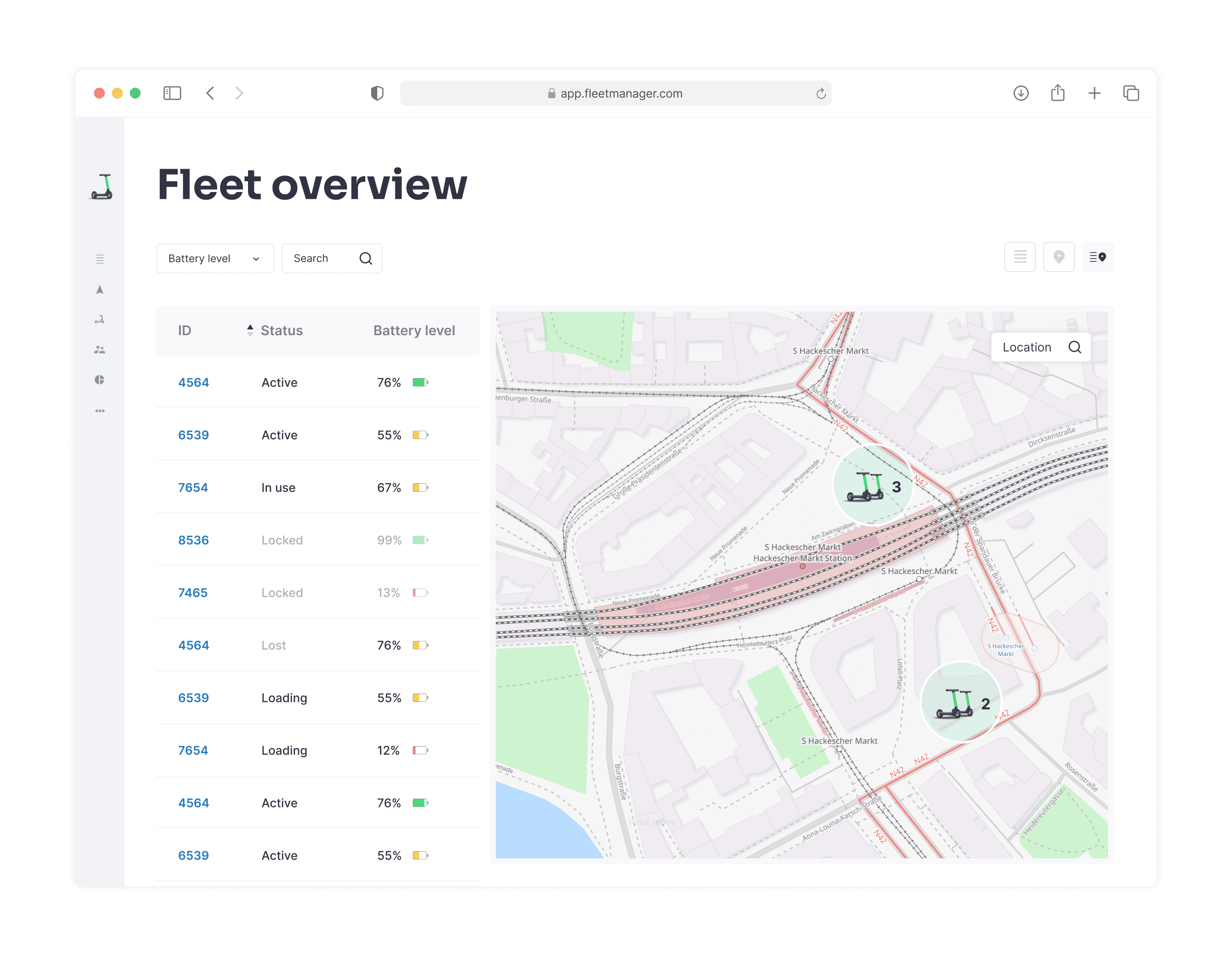
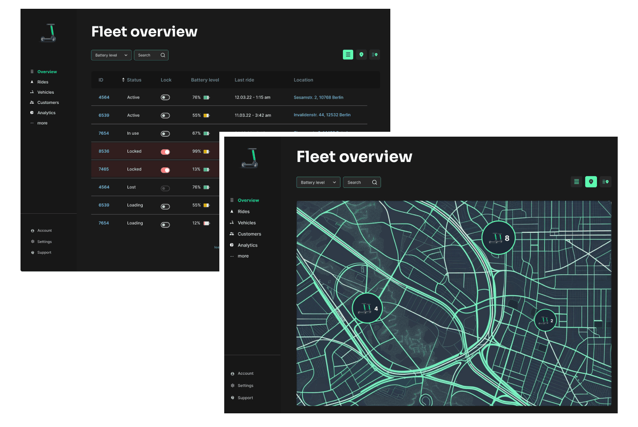
As we were not certain about every use case we went with 3 views. Our assumption was that users change views based on use case, rather than the experience level of the user itself. The view depends highly on what a user tries to archive: either managing a bunch of scooters or determine single ones. Location – for example – only is important to display on a map, when a relationship to specific buildings/streets needs to be determined.
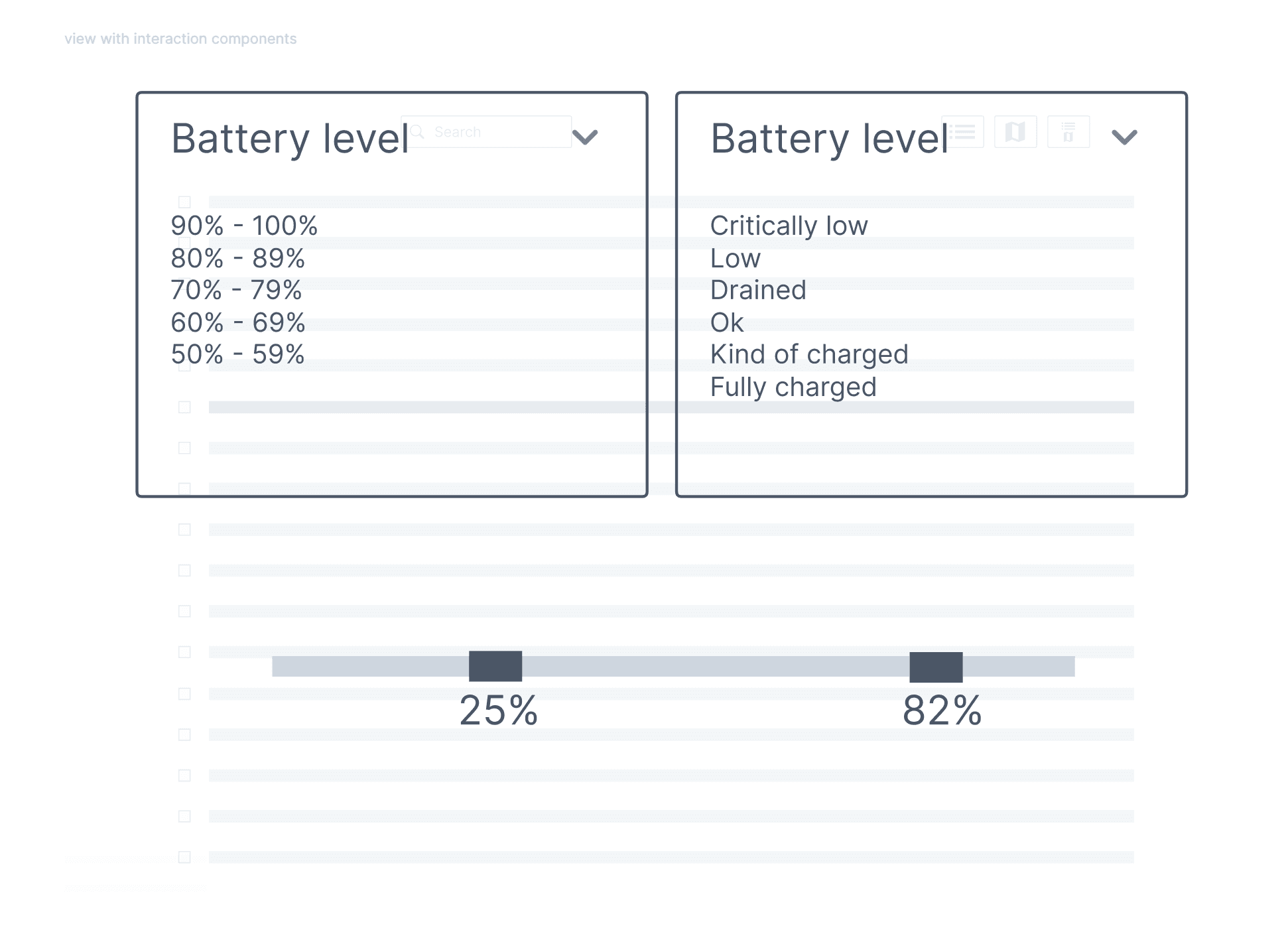
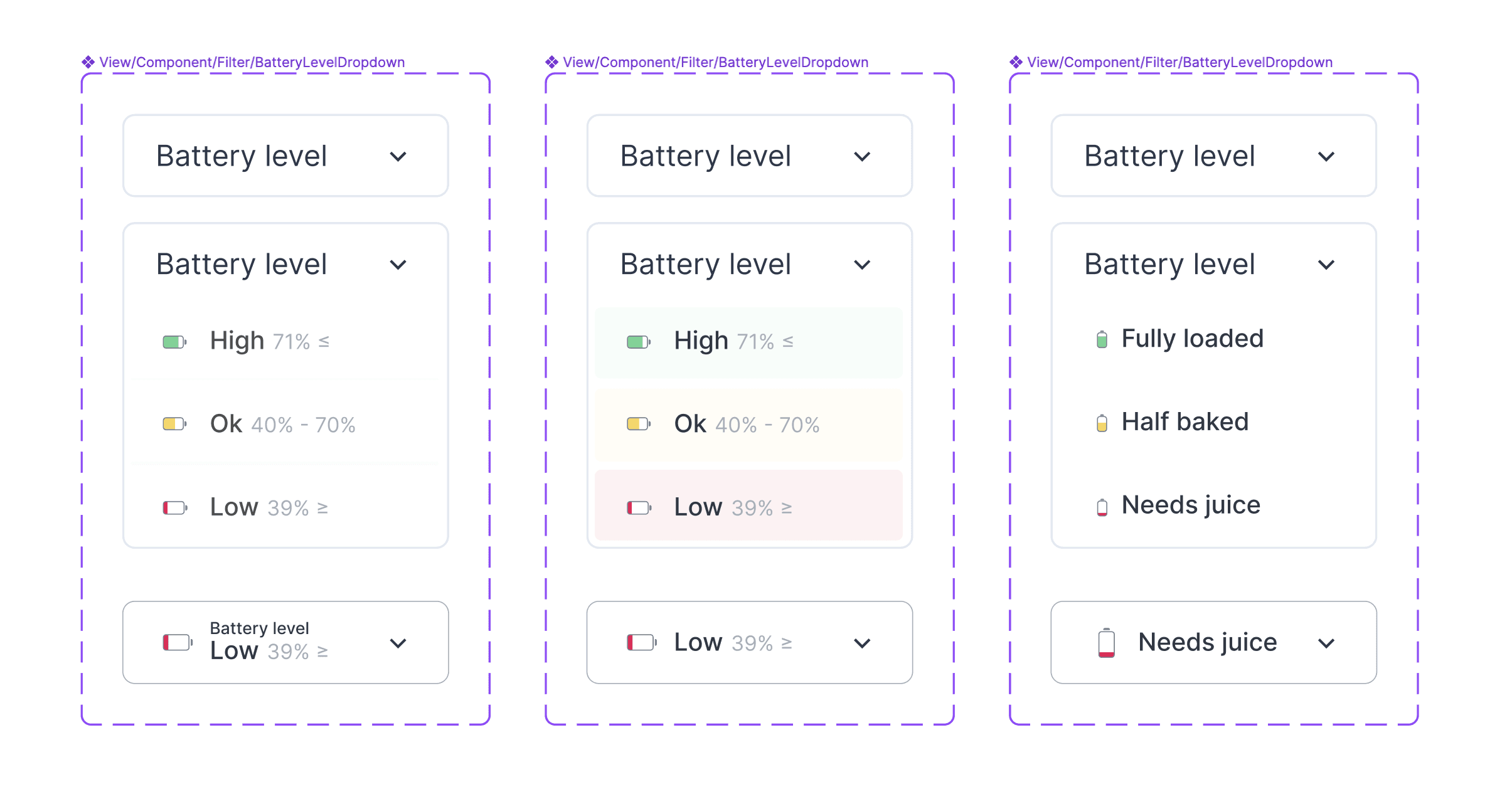
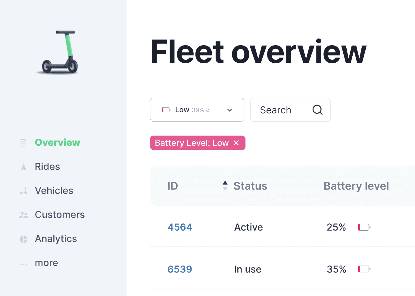
There are many ways to filter the battery level of a fleet of scooters - I wanted to find out the right one.
The question is how to deal with blind spots, when there is no research or information at all. Leveraging the desk research (how does X do it?) and asking ChatGPT to get more context. Of course this is still guess based design but that gave us two good approaches and a strong A/B testing vibe. Figuring out the right design sometimes is a on-the-fly process.
Lean way of key component development
Lean software design often means, designing and testing several various versions at the same time. Having a key component, that needs to work definitely for the key user group needs special attention. Every detail matters and with testing different components, we were once more heading towards our goal: building the right thing.
Detailed Design Approach
Making it obvious
One of the main goals was to make things as obvious as possible. Reducing error rates and enabling users to be safe and fast at the same time.
Working with scooters
Customer experience is key for a ride sharing company. The interface for the fleet operators needs to reflect those values. Not only does it work well, it also is fun and easy to switch status of scooters or navigate on a map.
Function can be fun
A good interface shields the users from all the technical yaddayadda under the hood. It is finished, when people can solve their tasks in a easy, fun and safe manner.
How about going dark?
Working shifts? Dark mode enables the operators to have an improved workflow during night hours.
I've enjoyed designing this product
Many more things are there to discover. How to test and develop the design, engineering and design success indicators, etc
Let's talk : )
2023
Berlin